One of tenets of Lean and the Toyota Production System “visual management”: making things (work, processes, status, etc.) clearly visible (or audible) to the status of the system.
For example is a guiding principle in “5S” to make it clear where objects should be places so that you can tell at a glance normal from abnormal condition, as well behind daily management practices of using visual management boards and leader standard work boards to make work status more visible.
Visual and audible cues to guide everyday life in Japan
I’ve been aware of some how this principle is evident in many aspects of daily life in Japan.
I’ve written about some visual management that I’ve observed in the past, including in public restrooms, supporting mistake-proofing at Starbuck’s and at my local gelato store (though I missed the visual depiction of the rules the first time around).
Here are some additional examples that I’ve encountered in everyday life in Japan.

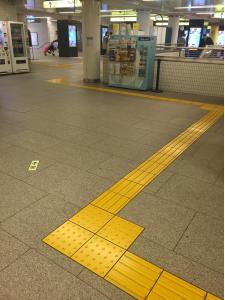
Follow the yellow raised path to find your way
One example of a visual cue, which is hard to miss as it is ubiquitous throughout Tokyo and other cities, is the yellow textured pathways that run throughout the city sidewalks, subway stations, and many buildings. I noticed that a similar system was used in Seoul, Korea.
The primary purpose is to help the blind stay out of danger’s way and more easily navigate the city.
But it also assists those of us who are sighted to quickly see where a path might end or more easily keep the flow of foot traffic.
It can be difficult to walk on the actual raised path, but that makes it effective for keeping sighted traffic to one side or the other and makes it easier for people with reduced vision to find their way.
Other cues are around train stations station, such as signs to know which side of the path or escalator to follow.

Listen to the tweets to get to the exit
The subway and train stations also have audible cues to help blind people find the escalators and exits.
The sound of birds chirping is any easy way to know what direction to turn to find the exit – and is a much more pleasant sound than beeps. I sometimes forget and look around to see why there are birds inside the train station!
Give up your seat

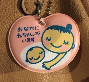
I just saw this visual cue that a pregnant friend had attached to her purse. She said that all pregnant women are given the tag at their doctor’s office. It helps quickly identify women who might want to sit down on public transportation. While in later months, it may be fairly obvious if a woman is pregnant, this way no one has to explain herself when asking for a seat.
I’d hope that many people would offer a seat up, but anecdotes told to me indicate that this is not common practice. Perhaps it could be because of the large number of people falling asleep on trains here in Japan.
It’s time to go home
Perhaps my favorite cue in daily living that I’ve come across is the “5 o’clock chime”. Without fail, every day, a wonderful children’s song is played over the loudspeakers in Tokyo.
My two boys love the 5 o’clock chime and rush outside to our balcony everyday to get a better listen. Other cities also have 5 o’clock chimes – many use this same song.

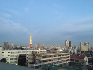
If you want to hear the 5 o’clock chime from our house, you can click this link: Tokyo 5pm chime. We live near a school with loudspeaker pointing towards are apartment, so the chime can’t be missed. Can you find the loudspeaker in the photo above?
This chime supposedly serves two purposes. First, it is a signal to children to go home to have dinner. Second (and probably the original reason), it is a way to test the emergency broadcast system daily.
This is a WAY more pleasant testing of the broadcast system that the horrible horns and sounds over the radio that they use in the United States.
Visual cues are only as good as the meaning they convey
The above examples are pretty clear, no matter what your cultural or language back ground is (though perhaps one might not know the reason for the 5 o’clock chime). However, a recent article in the Japan Times reminded me that symbols and visual systems are only as useful as the meaning they convey.
Japan revamps map symbols that baffle tourists https://t.co/aRRcpSSSre pic.twitter.com/U6W8vMIY0G
— The Japan Times (@japantimes) January 13, 2016
The article explained that Japan is changing some of the visual symbols it uses on maps, as to make more sense to foreigners.
I have to admit to being perplexed sometimes to why there was an “X” on a map in a spot that clearly wasn’t “here”. Swastikas to represent temples and shrines can also be confusing to foreigners who might associate swastikas for an opposite meaning and wonder why there are so many on every map (there are shrines and temples hidden in nooks and crannies around every few blocks in Tokyo).
I understand the comment that some Japanese want to keep the traditional symbols, but at the same time, as Japan prepares for the 2020 Olympics and becomes more open to foreigners, it is useful to think about the purpose of the symbols and how they help or hinder that purpose.
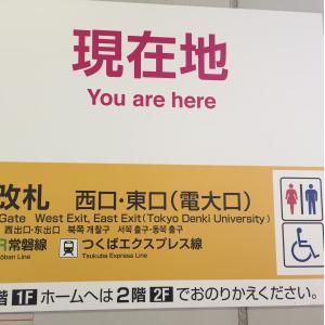
But a visual cue is way more helpful than a sign like the one below. Not very helpful in knowing where “here” is either! A visual depiction might be a bit more helpful…

I’ll continue to keep an eye out and ear out for more visual and audible cues to guide daily living in Japan!
What is your experience?
What visual and audible cues to you find in daily life in your country? Please share your examples and comments below.


